A shopping bag is usually designed to carry purchases. Yet some bags become recognisable products in their own right, attracting media attention, encouraging repeat purchases and extending a brand’s visibility beyond the store.
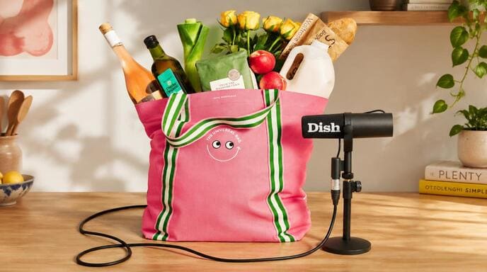
The collaboration between Waitrose, Dish and British designer Anya Hindmarch offers a recent example. Launched in late September 2026, their limited-edition Universal Bag combines supermarket retail, podcast branding, distinctive design and a recycling return system. Priced at £15, it is available through 225 core Waitrose stores and online. Made from 100% recycled plastic, it is weight-tested to carry up to 12 kg and includes a built-in freepost return pocket for end-of-life recycling.
The idea builds on a longer history. In 2007, Hindmarch’s I’m NOT A Plastic Bag tote sold for £5 and became a widely reported fashion phenomenon.
Although the two bags emerged in different contexts, both demonstrate how an ordinary carrier can acquire an identity beyond its basic function. Their significance lies not simply in their appearance, but in the combination of brand association, product design, consumer relevance and public attention.
For retailers, consumer brands and packaging buyers, the central question is: How can a shopping bag become a recognisable brand asset rather than just another piece of packaging?
Three Brands, One Product: Why the Collaboration Works
The Waitrose–Dish–Anya Hindmarch collaboration brings together three different forms of brand value.
- Waitrose provides the retail setting, access to grocery shoppers and a direct connection to everyday purchasing.
- Dish, Waitrose’s food and entertainment podcast hosted by Nick Grimshaw and Angela Hartnett, connects the product with food culture and an established media identity.
- Anya Hindmarch contributes design expertise and a reputation for turning familiar everyday objects into distinctive fashion and lifestyle products.
Each partner gives the bag something that a generic supermarket carrier would struggle to achieve on its own.
Waitrose makes the product relevant to an existing shopping routine. Dish gives it a connection to a recognisable content brand. Hindmarch supplies a distinctive design language that helps the bag stand apart from ordinary retail packaging.
The result is a product positioned somewhere between a reusable grocery bag, a branded merchandise item and a limited-edition accessory.
Several published details reinforce that positioning.
| Feature | Published detail | Role in the brand strategy |
|---|---|---|
| Retail price | £15 per bag | Positions it as a paid product rather than a free carrier |
| Distribution | 225 core Waitrose stores and online | Connects physical retail exposure with online purchasing |
| Load capacity | Weight-tested to 12 kg | Gives the design a practical grocery-carrying purpose |
| Material | 100% recycled plastic | Connects the product with a defined material claim |
| Visual identity | Pink body, green and white striped handles | Creates a recognisable appearance |
| Designer signature | Googly-eyes motif | Connects the edition to Hindmarch’s wider design identity |
| End-of-life system | Built-in freepost return pocket | Adds a practical component to the sustainability proposition |
| Purchase limit | Three bags per customer | Limits the number each customer can buy in one transaction |
Sources: John Lewis Partnership’s official launch announcement and Waitrose’s product listing.
The important point is that the collaboration does not rely on a logo alone. The product combines several recognisable associations in one physical object, giving customers multiple ways to identify it and understand its intended character.
The £15 price is also significant as a positioning decision. Unlike a standard carrier supplied as part of a grocery purchase, the bag is presented as something worth buying in its own right. That changes the role of the product: its appearance, identity and perceived usefulness become part of the purchase decision.
However, the published launch information does not establish total sales, sell-through rate or incremental revenue. The product demonstrates a clear brand strategy, but its commercial performance requires separate evidence.
How the Design Makes the Bag Recognisable
A collaboration needs a product that communicates its identity even when customers are not reading a launch announcement. The Dish Universal Bag uses colour, handles, graphics and a familiar shape to achieve this.
Colour and handles create a distinctive visual signature
The vivid pink body provides the main visual field, while the green and white striped handles create contrast. Together, these details distinguish the bag from a conventional supermarket carrier without making the design visually complicated.
The handles are particularly useful because they extend the identity beyond the printed surface. Instead of relying entirely on a logo, the design makes a functional component part of its visual signature.
This principle is relevant to other retail brands. Contrasting handles, coloured binding, distinctive stitching or a carefully selected lining can help create a recognisable product without covering every surface in graphics.
The lesson is not that pink and green are universally effective. It is that a consistent combination of colours and construction details can make a product identifiable as a specific edition.
The designer’s motif connects the edition to an established identity
The googly-eyes motif gives the bag a playful character associated with Anya Hindmarch’s wider accessories work.
Its role differs from that of the colour scheme. The pink body and striped handles distinguish the Dish edition, while the motif connects it to the designer’s broader creative identity.
This is an important feature of collaboration branding. A product needs to communicate both what makes the edition distinctive and which established brand or designer it belongs to.
For other businesses, the equivalent might be a signature illustration, recurring symbol, distinctive typography or familiar graphic character. The strongest choice is generally one that already has meaning within the brand rather than a decorative element added solely to attract attention.
A familiar tote format keeps the product useful
Despite its distinctive appearance, the Universal Bag retains a familiar shopping-bag format. Customers already understand how to carry it, load groceries and reuse it for different shopping trips.
The published 12 kg weight-test figure provides a practical reference point. It positions the bag as a functional shopping product rather than an accessory intended only for display.
The figure should not be interpreted as a universal guarantee under every usage condition. Actual performance depends on the test method, load distribution, duration of use and the bag’s condition.
The broader lesson is that a product does not need an unusual shape to become distinctive. A familiar format can acquire a new identity through colour, graphics, construction details and brand associations.
The return pocket makes sustainability part of the product experience
The built-in freepost return pocket is more than an additional feature. It gives the product a defined end-of-life process that customers can understand and use.
When the bag reaches the end of its usable life, the customer can fold it into the integrated pocket, which serves as a return envelope, and post it for recycling through the stated scheme.
This connects three different ideas:
- Recycled content: what material goes into the product.
- Recyclability: whether the material can be processed again under suitable conditions.
- A return system: how a used product can actually be collected for processing.
The Universal Bag combines a 100% recycled-plastic material claim with a specified return mechanism. The wider initiative also reports that more than 546 tonnes of plastic have been diverted from landfill since 2021. This is a programme-level figure, not a measurement of the environmental impact of the Dish edition alone.
Source: Anya Hindmarch’s Universal Bag project information.
The branding lesson is that a sustainability message becomes more concrete when it is supported by a product feature or operating system. Nevertheless, the environmental benefit still depends on how the bag is used, collected and processed.
What the design achieves
These features work together rather than independently. Colour and handles support recognition, the designer’s motif provides a wider brand connection, the tote format preserves everyday usefulness, and the return pocket supports the product’s sustainability positioning.
The bag therefore communicates several things at once: who is involved in the collaboration, what makes the edition distinctive, how it can be used and what happens at the end of its life.
That combination is more meaningful than simply placing three logos on an ordinary carrier.
From a £5 Tote to a £15 Collaboration: What Changed?
Anya Hindmarch’s 2007 I’m NOT A Plastic Bag campaign provides a useful comparison because contemporary reporting documented substantial consumer attention.

Launched in 2007 in collaboration with the social-change organisation We Are What We Do, the bag used a short environmental statement to connect an everyday purchase with concerns about disposable plastic bags.
According to contemporary reporting by The Guardian, 20,000 bags priced at £5 sold out in less than an hour at Sainsbury’s. Anya Hindmarch’s own campaign history also records that 80,000 people queued on the launch day. These figures describe different measures—stock sold and people queuing—and should not be treated as equivalent.
Sources: The Guardian’s 2007 report and Anya Hindmarch’s campaign history.
Three factors help explain why the earlier tote attracted attention.
A message that could be understood immediately. The slogan was short, prominent and easy to recognise. When carried in public, the bag communicated an idea as well as a product identity.
A relatively accessible price. At £5, the tote offered a way to participate in a designer-led campaign without buying a conventional luxury handbag.
Visible public demand. Queues, limited availability and media coverage helped turn the product into a news story. The launch generated attention that extended beyond the original retail transaction.
The 2026 Universal Bag follows a different route. Instead of relying primarily on an environmental slogan, it combines a supermarket, a podcast and a designer with a recognisable visual identity, a £15 retail price and a built-in return feature.
| Dimension | 2007 I’m NOT A Plastic Bag | 2026 Dish Universal Bag |
|---|---|---|
| Core idea | Reusable shopping linked to an environmental message | Retail, media and designer identities combined in one product |
| Main communication device | A prominent slogan | Colour, handles, designer motif and collaboration identity |
| Reported retail price | £5 | £15 |
| Documented attention | 20,000 bags sold in under an hour at Sainsbury’s; 80,000 people reportedly queued on launch day | Launch information specifies distribution and product features, but does not establish total sales |
| Sustainability approach | Environmental messaging and reusable-bag positioning | Recycled-plastic material and a defined return mechanism |
The comparison suggests that a shopping bag can become a brand asset through different routes. A clear social message can make a product culturally relevant; a cross-brand collaboration can combine existing audiences and identities; and a distinctive design can give customers a reason to recognise the product independently of its original retail setting.
Neither example proves that attention automatically translates into profit or sustained reuse. The earlier campaign provides documented evidence of strong launch demand, while the long-term commercial impact of either strategy requires additional data.
How a Shopping Bag Becomes a Brand Asset
The two campaigns point to four connected mechanisms that help explain how a functional product can acquire brand value.
Recognition: customers remember the product
A recognisable colour scheme, slogan, symbol or construction detail helps distinguish a bag from competing products.
The 2007 tote used a short statement as its central identifying feature. The Dish edition uses a more layered system of colours, handles, a designer motif and partner associations.
The objective is not simply to make the bag attractive. It is to make the product recognisable without requiring customers to read a full description.
Meaning: the bag represents something beyond its function
A conventional carrier communicates little beyond the retailer that supplied it. A branded edition can also communicate a design preference, a social message, an affiliation or participation in a particular collaboration.
In the 2007 campaign, the environmental slogan gave the bag an explicit message. In the Dish collaboration, the combination of grocery retail, food-related media and designer identity creates a different set of associations.
These meanings are not guaranteed to resonate with every customer. Their effectiveness depends on whether the intended audience recognises and values the message.
Repeated use: the product carries the brand beyond the store
A reusable shopping bag can appear in supermarkets, workplaces, public transport and other everyday settings. Each use creates an opportunity for the design to be seen again.
This is one reason a shopping bag can have a different marketing role from a receipt or a short-lived advertisement: the physical product may remain in circulation after the original purchase.
However, potential exposure should not be confused with measured reach. Actual visibility depends on how frequently the bag is reused, where it is carried and whether other people notice the design.
Product credibility: the experience supports the story
A brand message becomes more convincing when the product itself supports it.
For the Dish edition, the practical tote format and stated load capacity support everyday use, while the return pocket gives the recycling proposition a specific mechanism.
For another brand, credibility might come from durable construction, a useful format, documented recycled content or a design that genuinely reflects the brand’s identity.
The underlying relationship is straightforward: recognition attracts attention, meaning gives the product identity, usefulness supports continued use, and credible features help the brand story withstand scrutiny.
Why Collaboration and Limited Editions Can Create Demand
The Universal Bag also illustrates how a familiar product can be refreshed through collaboration.
The basic function of a shopping bag is already understood. Customers do not need to learn a new way to use it. The collaboration can therefore focus on giving the familiar format a distinctive appearance and a relevant story.
Four factors shape this approach.
- A recognisable partner. A retailer, media brand or designer provides context that a generic printed bag may lack.
- A distinctive edition. Colours, graphics and construction details help distinguish the product from standard merchandise.
- Controlled availability. A limited release can create urgency, although scarcity alone does not guarantee demand.
- A repeatable concept. New partner-specific editions can refresh interest without requiring a completely new product structure.

The Dish collaboration is particularly interesting because it connects a physical retail product with a podcast identity. Waitrose customers may encounter the bag in-store, podcast listeners may recognise the media brand, and Anya Hindmarch contributes an established design language.
This creates a potential connection between content and commerce. However, the size of the overlapping audiences and the effect on purchasing behaviour would need to be measured rather than assumed.
Limited editions also have commercial risks. Additional colours or collaborations may encourage repeat purchases, but they can create excess inventory if the expected demand does not materialise.
For brands considering this approach, useful measures include sell-through rate, repeat purchases, customer feedback, gross margin and the quantity of unsold stock. Media attention should be evaluated separately from sales performance.
How Brands Can Apply the Same Principles
The transferable lesson is not to copy the Dish bag’s pink body, striped handles or designer motif. It is to understand how the collaboration connects brand identity with a product people can use.
| Brand objective | Practical approach | What to measure |
|---|---|---|
| Increase recognition | Develop a consistent colour scheme, logo treatment or signature detail | Brand recall and customer recognition |
| Strengthen brand identity | Connect the design to an existing message, visual style or relevant partner | Customer associations and campaign engagement |
| Encourage repeat use | Prioritise suitable capacity, comfortable handles and durable construction | Usage frequency and product lifespan |
| Create launch interest | Use a relevant collaboration or limited-edition design | Sell-through rate and earned media coverage |
| Support a sustainability message | Specify recycled content and document the return or disposal process | Material traceability and actual return rates |
| Support premium positioning | Match materials, printing and finishing to the intended customer experience | Willingness to pay and contribution margin |
These objectives should not be treated as interchangeable. A bag that generates substantial publicity may not deliver strong margins. A product that sells out may not be reused frequently. A reusable bag with recycled content does not automatically deliver a lower environmental impact in every situation.
For example, selling 10,000 bags at £15 each would generate £150,000 in gross sales revenue before discounts, taxes and other adjustments. That figure is not profit. Manufacturing, logistics, marketing, retail margins and other costs still need to be deducted.
A meaningful evaluation should distinguish three outcomes:
- Commercial performance: revenue, gross margin, sell-through rate and unsold stock.
- Brand performance: recognition, customer engagement and repeat purchasing.
- Product performance: durability, reuse frequency, customer satisfaction and participation in any return scheme.
This distinction helps brands determine whether a shopping bag is functioning as a profitable product, an effective marketing asset or both.
From Brand Concept to Production: The Manufacturer’s Perspective
A strong brand concept still needs to work as a physical product. From a manufacturing perspective, the key task is to translate the intended identity into materials, printing and construction that can be produced consistently.
Material and appearance need to support the same positioning
Non-woven polypropylene can suit economical promotional bags and retail carriers. Laminated non-woven material supports detailed printed graphics and offers some splash resistance. PP woven material can suit more structured applications, while canvas may fit brands seeking a textile appearance.
These materials create different visual and functional results. The choice should reflect the intended customer experience, expected use, required finish and target cost rather than appearance alone.
Distinctive details need to work in production
The Dish bag shows how handles and the main body can form one visual system. For a custom product, the body colour, handle colour, printed artwork and decorative details should be assessed together.
Colour matching, material texture, printing method and handle attachment can all affect the final result. A sample should therefore be reviewed before mass production, particularly where a particular colour combination or construction detail is central to recognition.
Product quality supports brand credibility
A bag intended for frequent grocery shopping has different requirements from a lightweight event giveaway. Dimensions, material specification, handle attachment and reinforcement all affect its suitability for the intended load.
The stated capacity should be supported by an agreed test method rather than inferred from fabric weight alone. If sustainability forms part of the brand message, material documentation and any relevant certification should also be verified.
At Jiarong Packaging, the development process involves aligning bag type, material, dimensions, printing and construction with the customer’s brand positioning and intended use. The aim is to turn the design concept into a product that can be manufactured consistently to the agreed specification.
For B2B buyers, this is the practical link between branding and production: the visual identity needs to survive the transition from artwork to sample to finished product.
Conclusion: A Shopping Bag Can Become Part of a Brand’s Identity
The Waitrose, Dish and Anya Hindmarch collaboration shows how an ordinary shopping bag can become more than a retail carrier by combining three complementary identities: a supermarket, a food and entertainment podcast, and a designer known for distinctive everyday accessories.
Its £15 price, availability through 225 core Waitrose stores and online, 12 kg tested load capacity, contrasting colours, striped handles, designer motif and built-in return pocket give the product a clear identity. The design helps distinguish the edition, the familiar tote format preserves its everyday purpose, and the return mechanism supports a defined end-of-life process.
The 2007 I’m NOT A Plastic Bag campaign demonstrates a different route. A £5 price, a concise environmental message, limited availability and concentrated publicity helped turn a simple tote into a widely reported product.
Together, the examples show that there is no single formula for turning a shopping bag into a brand asset. The underlying principle is to combine a recognisable identity, a relevant story and practical value in a product customers have a reason to use.
For retailers and consumer brands, the opportunity is not simply to print a logo on a bag. It is to create a product that represents the brand beyond the original transaction—and to measure whether that recognition leads to meaningful commercial and product outcomes.
For businesses planning a branded shopping bag for retail, promotion or customer reuse, the next step is to translate the concept into a production-ready specification. Contact Jiarong Packaging to discuss suitable materials, custom printing, construction options and a quotation based on your design and order quantity.